🌗 I led the platform-wide rollout of dark mode and design tokens at Jostle – co-creating a shared language across teams and meeting 100% WCAG 2.2 AA colour standards platform-wide
role + timeline:
As the design lead, I drove the strategic vision for theming and accessibility within our design system over a year-long rollout – resolving colour contrast issues, developing a new WCAG-compliant colour palette, and co-creating a scalable design token framework in close collaboration with design, development, and QA teams.
Success Metrics:
✅ 🌓
Delivered the most requested feature for customers
This is a partial look at the work, with some details kept private due to confidentiality agreements.
Framing: A Foundational Design Challenge with Strategic Leverage
Jostle’s platform was limited by a fragmented and inaccessible colour system – impacting usability, brand consistency, and accessibility compliance. Meanwhile, rising customer demand for dark mode exposed the absence of a scalable theming infrastructure.
I led a cross-functional initiative to architect a semantic design token system, rebuild our colour palette to meet WCAG 2.2 AA, and deliver a platform-wide dark mode.
Rather than treat dark mode as a surface-level feature, we used this as a strategic way to get buy-in to modernize our design system, improve implementation efficiency, and create long-term alignment between design, development, and QA.
The Problem: A Legacy Palette That Was Limited
Before this initiative, Jostle’s design system had several limitations:
- Inconsistent colour usage across the product – Without defined roles or visual hierarchy, colours were applied ad hoc, leading to a lack of cohesion, unclear UX patterns, and visual debt across the UI.
- Non-compliant colour palette – Many UI elements failed WCAG 2.2 AA contrast ratios, limiting usability for customers with low vision and undermining accessibility requirements in enterprise RFPs.
- Not enough colours defined – which impacted how components could be made
- A lack of dark mode – our number one requested feature
- The need for a shared language across teams – going beyond global enums to having defined roles for colours
Our previous palette lacked hierarchy, accessibility, and clear intent.
Addressing colour, tokens, and theming as a unified system helped secure early buy-in and accelerate alignment.
Problem Statement:
How might we create a scalable light and dark mode system – grounded in accessible, intentional colour choices and aligned across design, dev, and QA?
My Approach:
Platform-wide Colour Audit
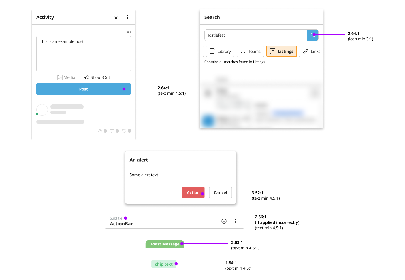
I led a full audit of the Jostle UI to identify accessibility fails and establish a baseline for accessibility, which revealed:
- links and buttons failed to maintain the required 4.5:1 contrast ratio set by WCAG 2.2 AA
- alternative text colours lacked sufficient contrast, often falling below the minimum 4.5:1 ratio
- some icons failed to meet the minimum 3:1 contrast ratio
Below are examples of some of the audit findings:
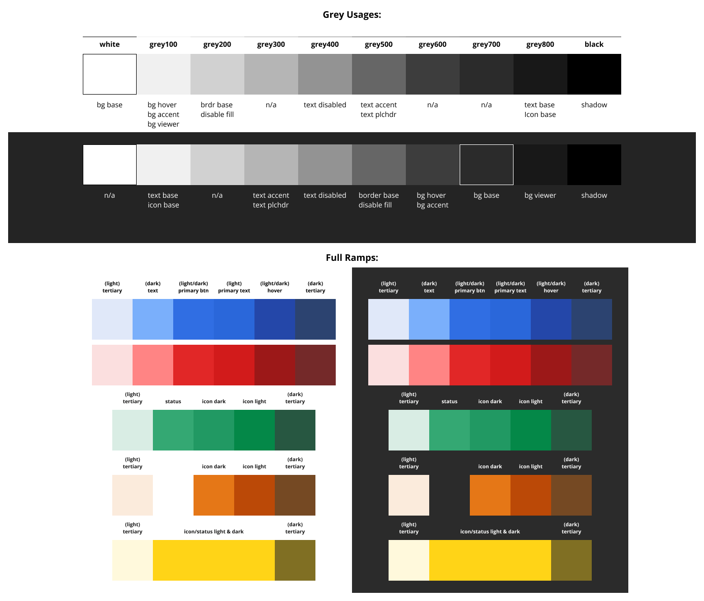
Refreshed Colour Palette – With Accessibility at the Core
I led a series of design team workshops to develop a system-wide colour palette that met WCAG 2.2 AA standards and positioned us for future adoption of APCA.
Rather than simply expanding the old palette, we rebuilt it from the ground up – focusing on accessibility, visual hierarchy, and long-term scalability. The updated palette reflects a more mature visual language and enables consistent application across both light and dark themes.
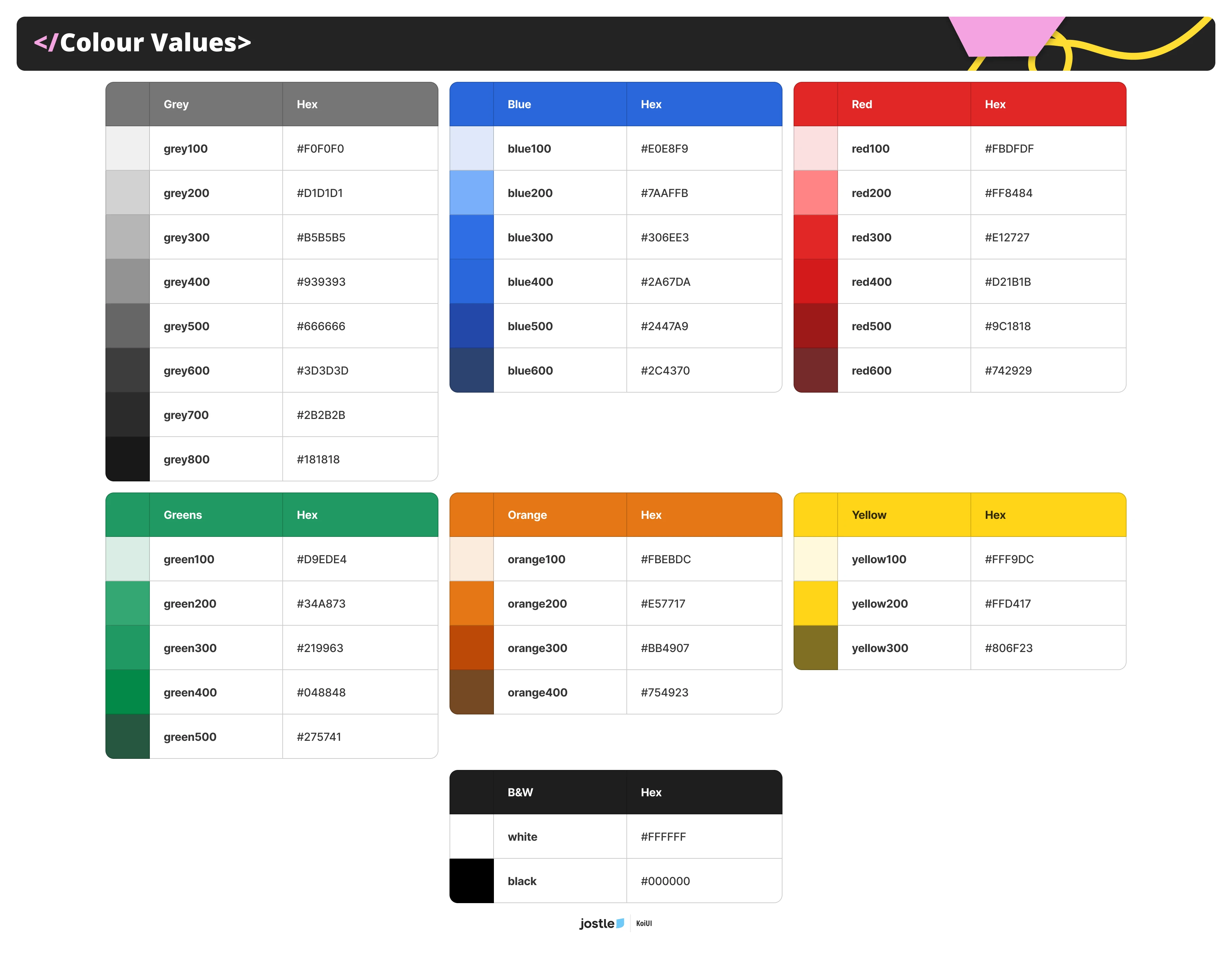
Throughout multiple iterations, we challenged ourselves to:
- Normalize opacity values for clarity and reuse – for example the lightest tints in light mode and the darkest tints in dark mode share the same opacity as the core value.
- Define a scalable tonal range – ensuring enough steps for visual hierarchy without overextending the system.
The result was a future-proof palette grounded in clarity, intent, and accessibility – enabling teams to design with confidence across modes.
Step Strategy:
A key initiative of our colour system was establishing a clear step strategy – a structured progression of tones that supported hierarchy, interaction states, and visual elevation without overwhelming the system.
Rather than arbitrarily adding light/dark variants, we defined a finite set of “shifts” that mapped directly to specific roles in the UI. Each shift had a deliberate purpose – whether for surface background, hover states, disabled text, or tooltips.
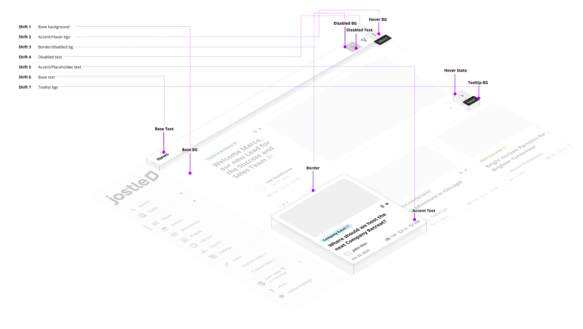
These shifts then created a set of constraints, which allowed us to:
- Know how many shades to account for since we set these shifts as our minimum
- Ensure accessible contrast between layers and interactive states
By limiting the number of tonal steps while maximizing clarity, we created a system that was both scalable and intentional – minimizing colour debt while supporting future growth across light and dark themes.
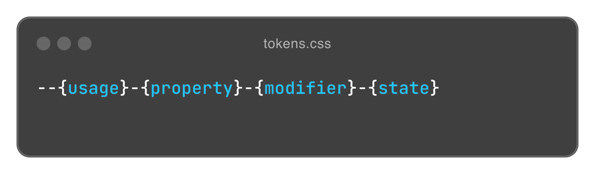
Implementing Semantic Design Tokens – Aligning Teams on a Scalable Foundation for Dark Mode
To enable dark mode at scale – and bring clarity to colour usage across the platform – I led a series of internal workshops to define a semantic design token system, with a core focus on early cross-functional buy-in.
These sessions brought together design, development, and QA to ensure the token language would be intuitive, adoptable, and durable across implementation workflows. By involving stakeholders from the start, we shifted token architecture from a design-only initiative into a shared system decision.
We began by mapping recurring UI patterns across the platform, then collaboratively grouped them into clear, functional roles. These patterns became the foundation of our token naming convention – ensuring that every label reflected shared understanding across teams.
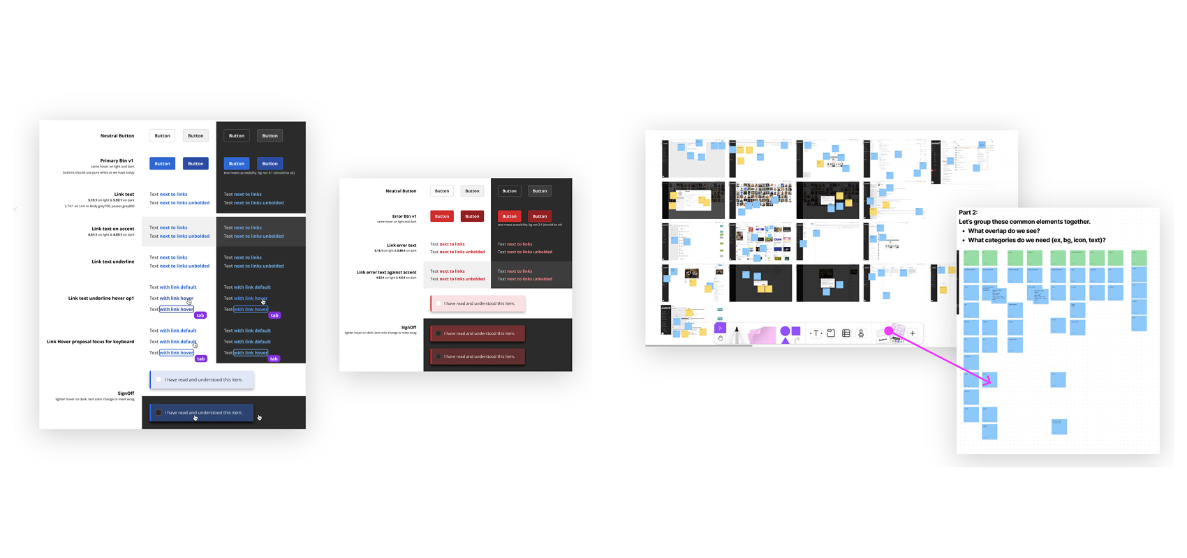
We deliberately avoided overloading the system. Instead, we focused on intent-driven naming and a minimal, functional set of tokens to ensure clarity and scalability.
With this structure in place, dark mode became a straightforward theme-mapping layer – enabling reliable system-level theming without brittle overrides or component-specific exceptions.
Outcomes & System Impact:
For the platform…
Over the course of a year, we aligned design, development, and QA through co-created naming workshops – establishing a shared, scalable language for colour and theming. The new design system was fully released in 2024 after a year of cross-functional implementation.
Our updated colour system met full WCAG 2.2 AA contrast standards across both light and dark modes – empowering teams to design and build accessible experiences. Most importantly, it enabled the launch of dark mode – delivering on our most requested feature and meeting long-standing customer expectations.
For the design system team…
Driving change was the hardest part – but also the most impactful. As a result:
- Reduced handoff friction between design and development – both teams made faster, more confident decisions around colour usage
- QA processes improved, with testers no longer relying on memorized hex values to validate design intent
- Significant drop in colour-related bugs, thanks to shared language, tokenization, and a more intentional system
- Adding new colour tokens became a collaborative, system-minded process – with scalability and long-term impact always part of the conversation
Beyond Jostle…
This work has extended beyond the walls of Jostle. I’ve shared our approach to accessibility and design tokens as a tool for change management at multiple conferences, including:
- Stockholm Xperience Conference – speaking on design tokens as a bridge between accessibility and organizational alignment
- UXxUX Conference (Vancouver) – presenting Jostle’s dark mode and token rollout
- Vancouver Design Community – leading a workshop on implementing and scaling design tokens
Next Case Study
Jostle Search