🔍 I led the overhaul of Jostle Search – with a unified search component experience, expanding searchable entities by over 10% of the platform, and enabling users to quickly find what they need based on their access and role
role + timeline:
My role was executing the complete design vision strategy for our next version of search – ensuring scalability and addressing previous customer pain points. I helped to deliver the initial concept to the full customer release, working with dev and product teams – shipping these changes in 2024/2025.

Success Metrics:
10+
Redesigned Search resolved long-standing customer pain points and delivered high-impact feature updates
This is a partial look at the work, with full details kept private due to confidentiality agreements.
The Problem – “Old Search”
Jostle’s old search was slow, fragmented, and lacked context—making it hard for users to find what they needed. The goal was to unify the experience, improve result relevance, expand coverage, and boost performance.
List experience. Simplified experience.
The result was a single, consistent search experience that expanded coverage to more of Jostle’s content – complete with smarter metadata matches, faster performance, and clearer context on why results appear.
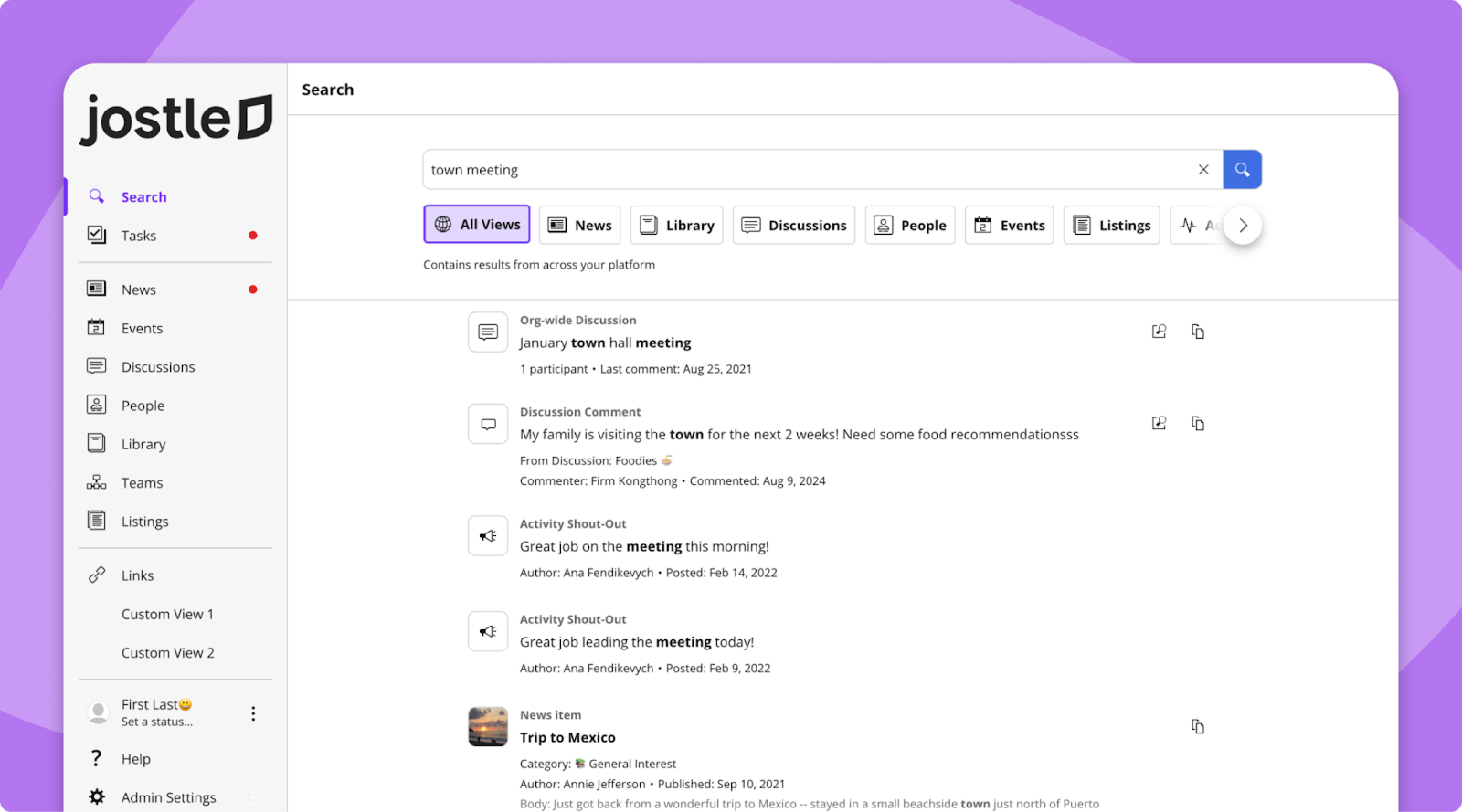
Tabbed Views
Customers can access different areas of a platform – and sometimes you need to find something in a specific area. A tabbed view switcher lets users easily switch between result categories. This made the experience feel more focused and helped people explore results without losing context.
But what about AI?
👀 stay tuned…
Reflection
Leading this project taught me how to design at scale – and build trust with a critical path that every user will likely interact with in the platform. In projects like this – it reinforced the importance of flexibility in design systems, and pushed me to think about how data needs to be structured, passed, and displayed to support a scalable, consistent experience.
Next Case Study
Plan Your Vote