🗳 158 candidates. One randomized ballot. And a voter who only uses this civic tool once every four years.
I helped redesign Plan Your Vote – a city-run microsite that helps citizens navigate randomized ballots with clarity, accessibility, and confidence
role + timeline:
My role was co-leading accessibility user testing with another designer and using research insights to inform key UI improvements across candidate selection and voting location flows. As a UX intern, I collaborated with designers and developers – helping the team deliver the full release in Oct 2018.
Success Metrics:
↑89%
Strengthened the City's overall digital strategy by improving engagement with civic web resources
Ah yes…Voting!
You’ve probably voted before–whether it’s federal, provincial, or municipal. It’s usually a routine experience: look at candidates, make your selections, and cast your vote. But depending on where you vote, you may have felt overwhelmed by the sheer number of candidates.
That’s the goal Plan Your Vote aims to solve. This tool gets released every 4 years during the municipal election, and I helped to inform some of the changes for the 2018 version, improving on the 2014 version.
For the 2018 municipal election, we redesigned the experience to address two major challenges: improving accessibility and adapting to a new randomized ballot format.
Primary Journey:
Because Plan Your Vote helps you select your candidates and voting location, the journey of using the tool takes place in the research and preparation stage of voting. This helps the platform act as a single touchpoint to reduce stress and increase clarity before voters arrive at the ballot box.
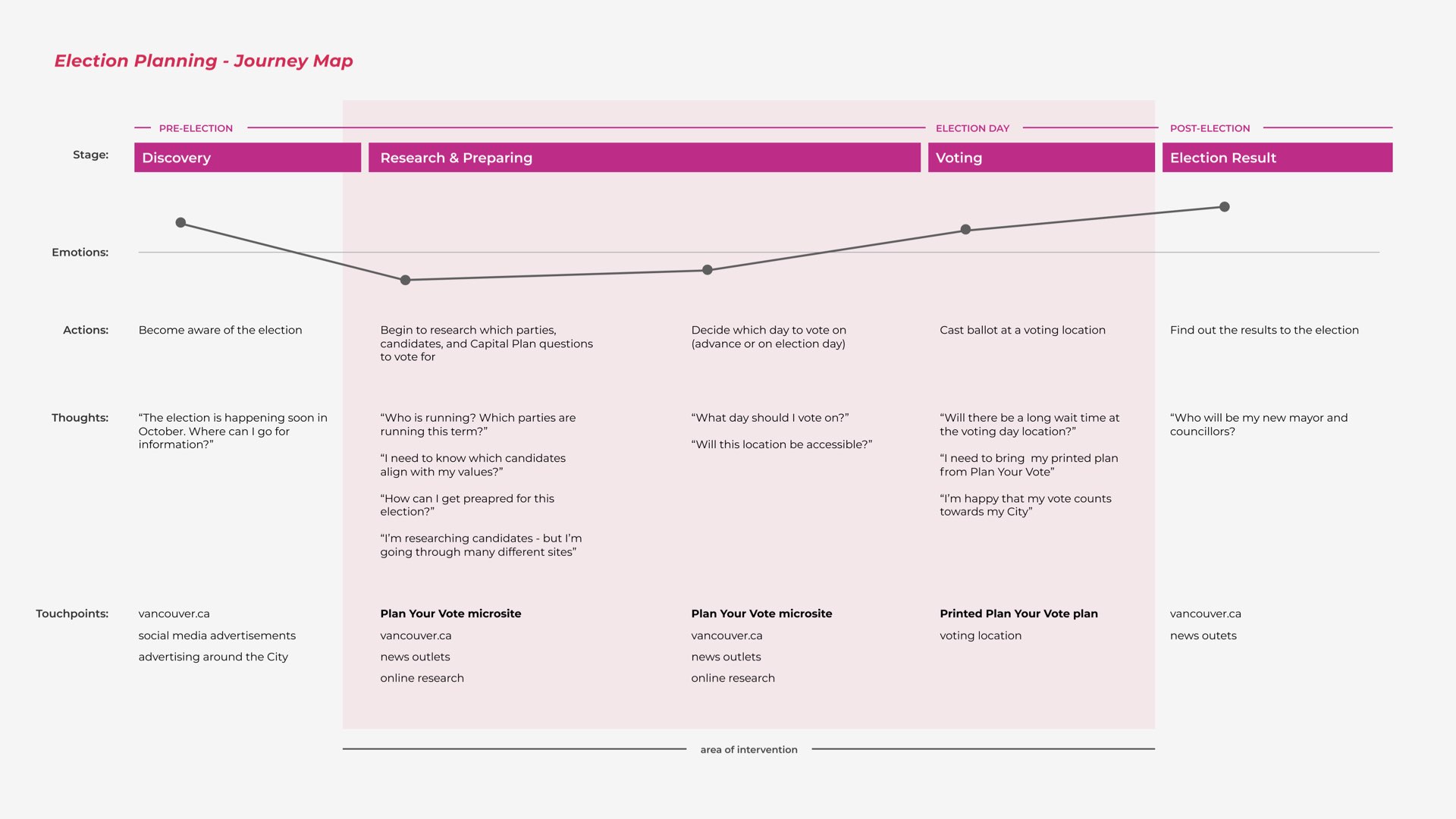
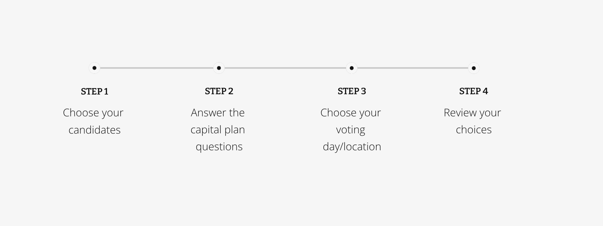
This supports the primary flow of Plan Your Vote:
- Choose your candidates
- Answer capital plan questions (questions on how the city spends money)
- Choose a voting location
- Review your choices
- Print your plan
Accessibility First
Feedback from the 2014 version revealed significant accessibility issues, particularly for blind, low-vision, and mobility-impaired users. Key findings included:
- Blind users lacked ARIA feedback for screen readers.
- Screen magnification users struggled to find buttons and input fields.
- General users found information architecture difficult to navigate.
Key Insight:
To provide an optimal vote planning experience for all...we need to optimize accessibility needs for the 2018 scope
Framing the Challenge
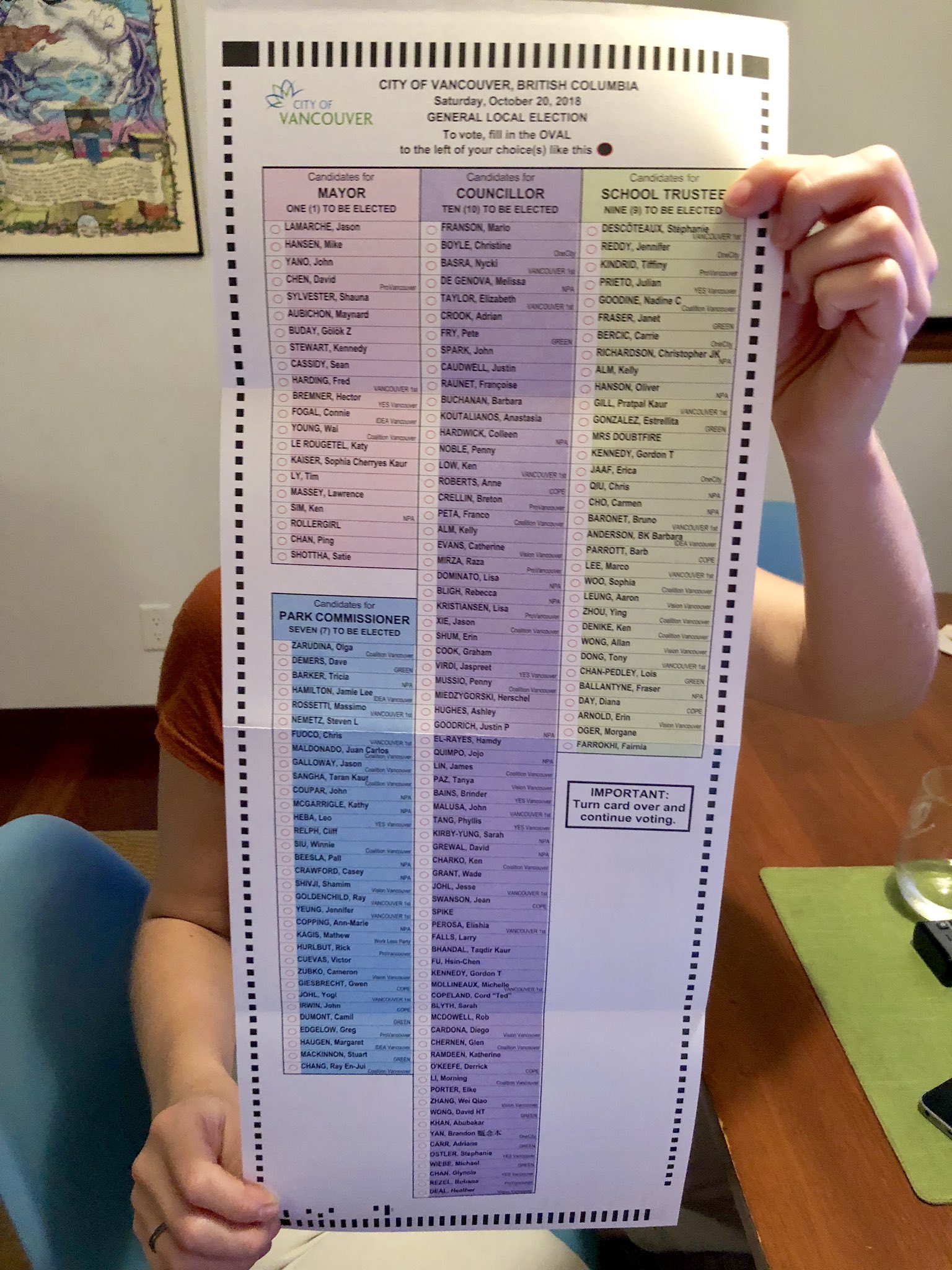
In 2018, the City introduced a significant change: instead of listing candidates alphabetically on the ballot, they were arranged in a predefined random order to reduce cognitive bias.
Below was the actual voting ballot for the 2018 election. Pretty long and complex eh? So with 158 candidates, this created substantial cognitive overhead for voters trying to find and remember names.
And a unique challenge is that the Plan Your Vote microsite is used only once every four years–meaning every user is effectively a first-time user. No one remembers how the tool worked last time.
Problem Statement:
How can we reduce the cognitive overload of navigating 158 randomized candidates in a single session – while ensuring the experience remains accessible to all citizens?
158 Candidates and Random Ballot Order
Typically on election ballots, candidates are sorted alphabetically. But the City decided on a pre-defined random order of candidates in 2018. The reason behind this was to reduce cognitive bias of candidates near the top of the ballot.
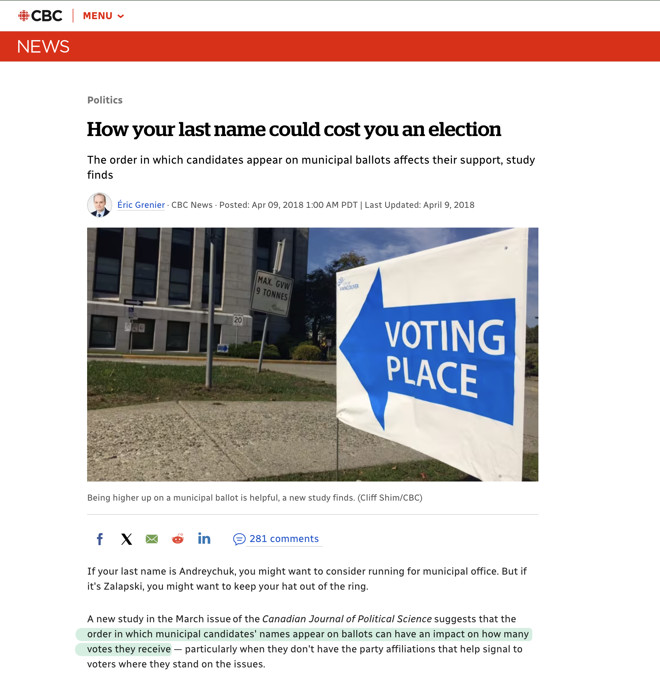
With so many candidates, this created friction. We estimated it would increase voting times – and it indeed did in the voting booth and made it harder to locate chosen names.
To reduce confusion, we updated Plan Your Vote to mirror the ballot order. This ensured that when voters created their plan online, it matched what they’d see in the booth–helping reduce hesitation and improving flow.
Moving to a Solution
To prioritize accessibility for the 2018 scope and make the right changes, we conducted user testing for individuals who were blind, low-vision, and had mobility needs. I helped to write the test plan and conduct user testing.
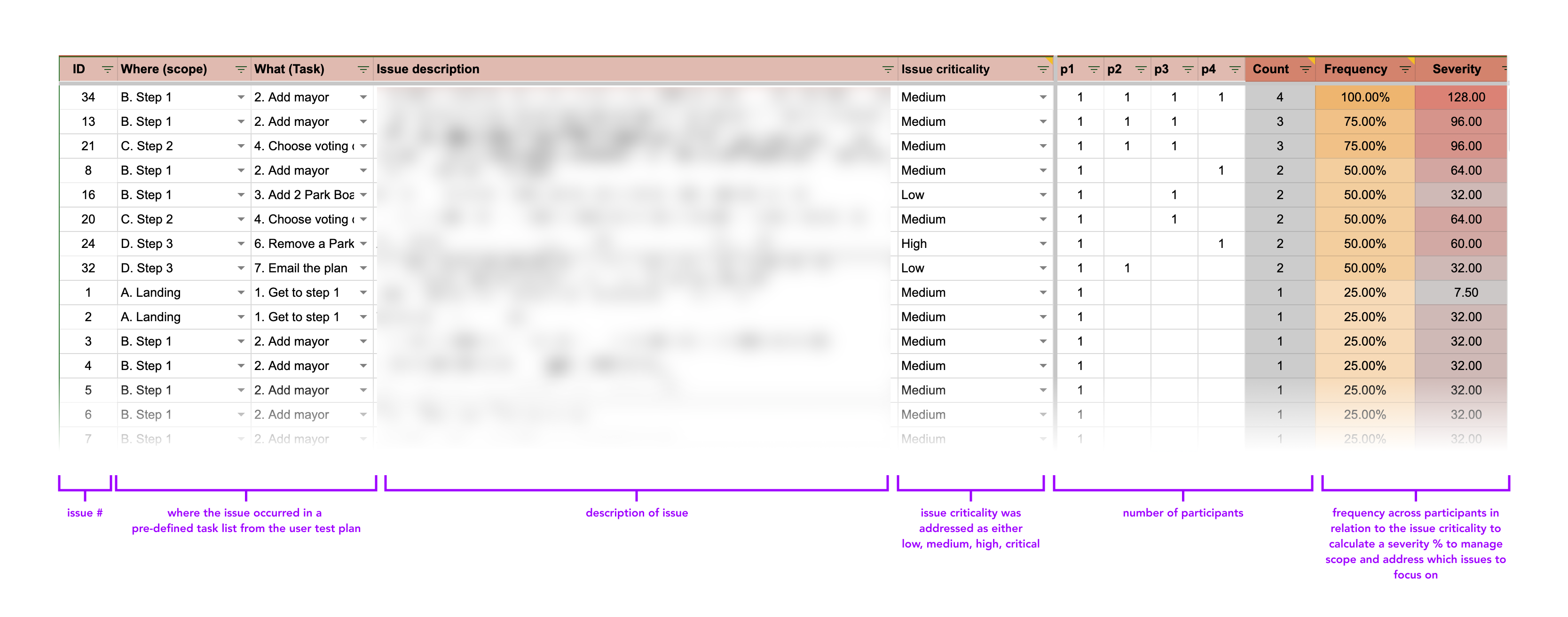
We then put all of our findings from the user testing – and organized them by priority, frequency, and severity to help determine which 60+ issues to prioritize.
Based on findings, we implemented the following key improvements:
- Enhanced ARIA support for better assistive technology interaction.
- Clearer information architecture for improved readability.
- Accessibility information added for all voting locations.
Outcome + Pages Revamped:
To manage scope, we chose to revamp the UI in specific areas, focused on emphasizing candidate selection and voting location with improved information architecture and accessibility features.
My direct contributions included:
- Improved ARIA support for screenreaders
- Clearer information about the context of the page
- Added accessibility information for voting locations
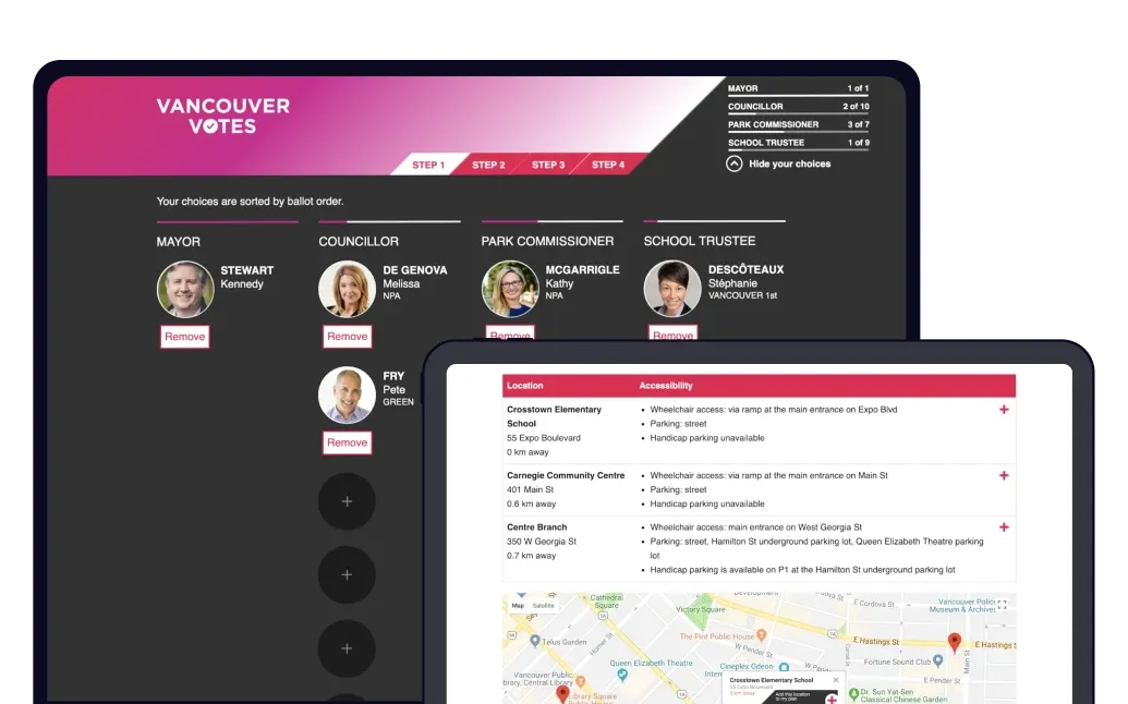
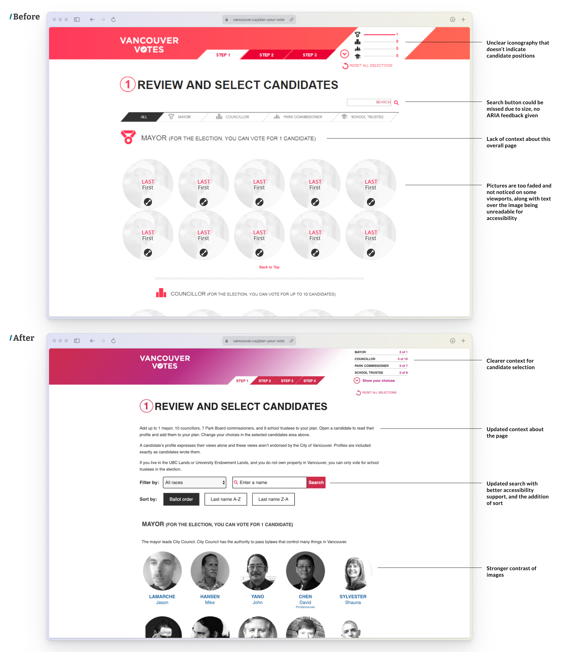
Updates to Candidate Selection page:
The updated home page provided clearer numerical context about the candidates chosen (text vs. unclear icons), updated copy to explain the page function, a more clear search functionality, and better contrast of images. Better ARIA support was updated as well.
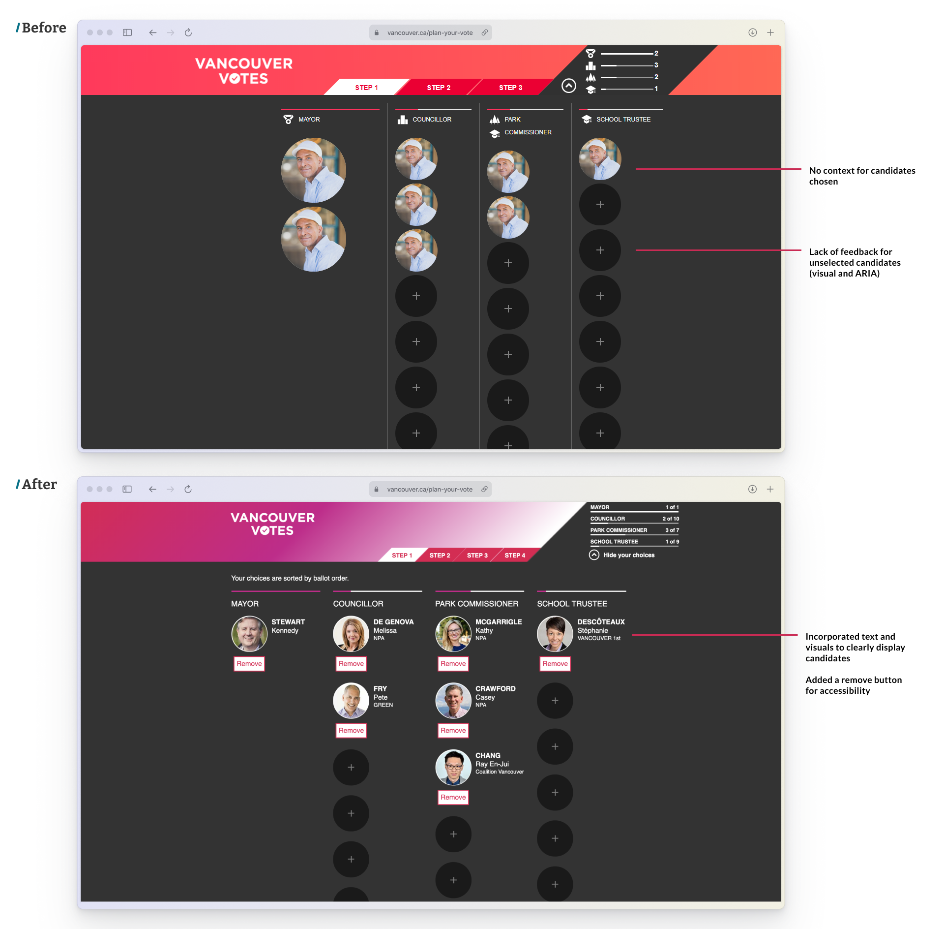
Candidate overview and review:
More clear actions were added to remove candidates and see their information.
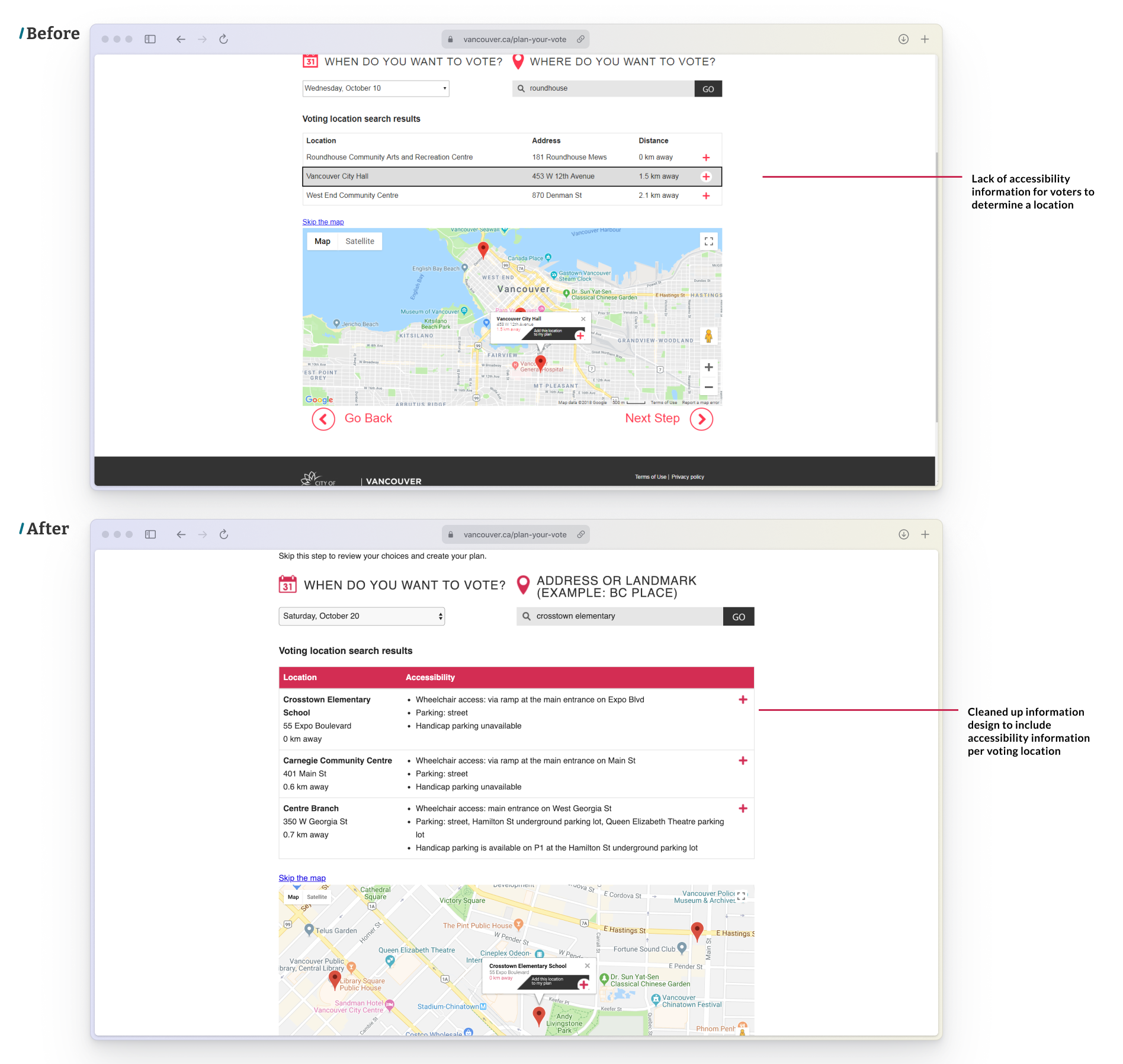
Location Selection:
Choosing a voting location was revamped, to include accessibility information about voting locations.
Reflection:
This project taught me that accessibility isn’t just a compliance box – it has real impact for people who use products. I’m grateful that this was my first ever professional UX project. Even as an intern, I had ownership over accessibility testing and helped shape key changes.
Next Case Study
Voice To Insight