case study
Plan Your Vote
tldr, what's this project about?
Helping citizens plan for voting in the municipal election, by choosing their candidates, their voting day, and location all in one consolidated website.
My role:
Accessible user testing and research to inform and devise the updated UI and strategy
Business Goal:
Update the Plan Your Vote platform for the 2018 election, with a focus on accessibility and information architecture
Team:
2 UX designers (including myself), design lead, 4 developers, and product manager.
Timeline + Scope
We completed this scope of work in 5 months (the election cannot be delayed!)
Highlights + Success Metrics:
- 48% increase in saved vote plans compared to the 2014 election
- Overall City election webpages saw an increase of 89% during the election campaign compared to 2014
Ahh yes...voting!
Ahh yes...voting, that political duty we do as citizens. Something that we do every 4 years, no matter who old we become, and no matter what accessibility needs we may have. Voting is such a unique challenge to design for, as this truly needs to account for everyone.
Plan Your Vote is a website offered by the City of Vancouver for every municipal election. This tool helps citizens view and choose candidates, choose their voting day and location, and answer capital plan questions in one consolidated website.
It was first offered for the 2014 election, and was being updated for 2018. The goal for 2018 was to help improve accessibility, along with the overall experience of the microsite. As a UX intern, I worked on these updates with the team.
Accessibility First
The first need for this tool was to focus on accessibility for all citizens using the tool. Building off the previous election's foundation in order to meet the needs of all citizens, I helped to conduct accessibility user testing from those who were blind, low-vision, and had mobility needs.
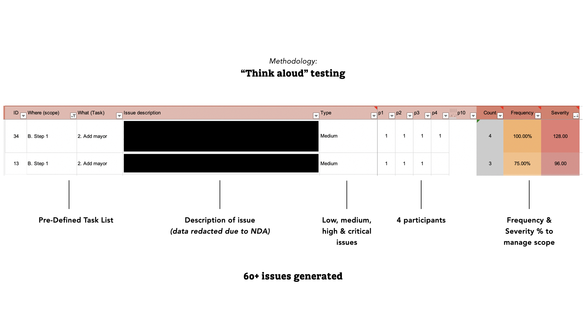
I helped to write the plan and conduct user testing, helping to generate over 60+ issues. At a high-level, we found:
- unclear feedback and unintended actions for candidate selection
- lack of context for pages
This set of data helped to inform our findings on where to plan scope of the product improvements for the 2018 election year.
Random Ballot Order
The next challenge for this year was random ballot order. Typically on election ballots, candidates are sorted alphabetically. But the City decided on a pre-defined random order of candidates in 2018. With 158 candidates to choose from, this was a new change for citizens, and could potentially lead to longer times in the voting booth to find their candidates.
With this challenge, we needed to update the microsite to account for this. Plan Your Vote is designed to help as a source that will provide users to create a plan to vote prior to vote day and export their plan.
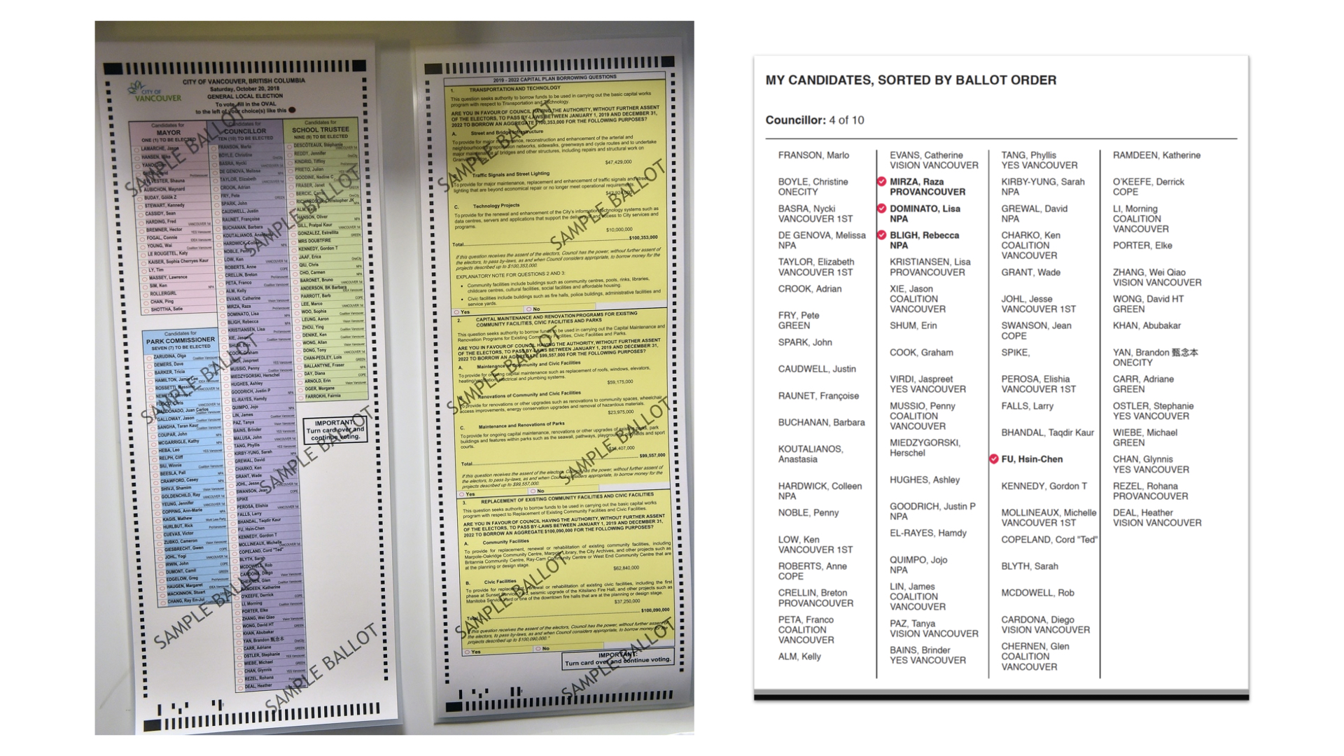
With this, whenever a user would create a voting plan (seen above), it would export in the same order as the ballot, reducing the cognitive load of trying to find that candidate on the ballot during the election. Citizens could bring this vote plan to the election, which hopefully helped to speed up the process of voting during election day.
Outcome:
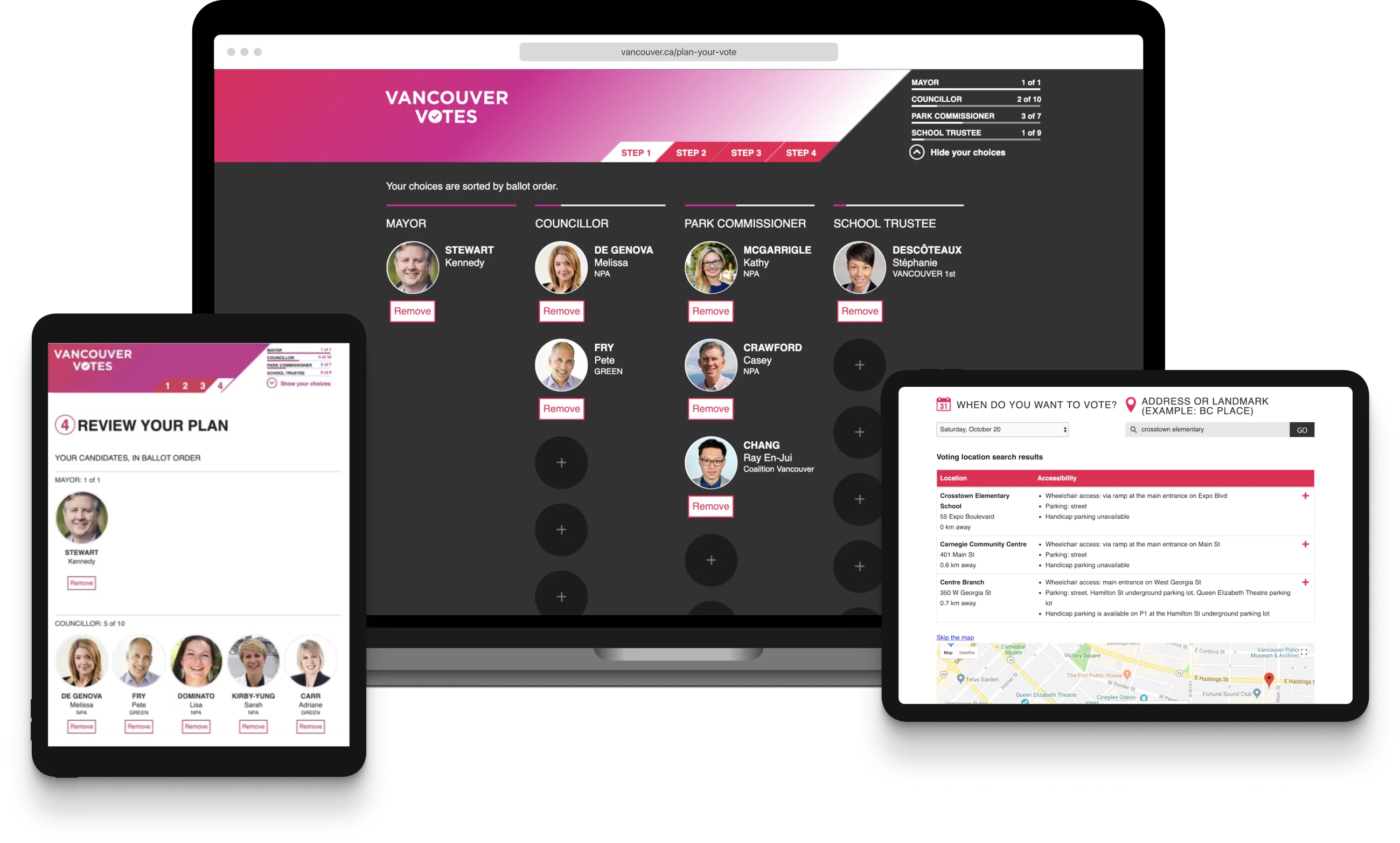
To manage scope, we updated certain critical areas of the UI, core to helping people choose their candidates and voting locations, with a focus on better information architecture and accessibility. Because this page wasn’t a product people come back to often, it was critical to optimize for the first time experience of the page.
Candidate selection:
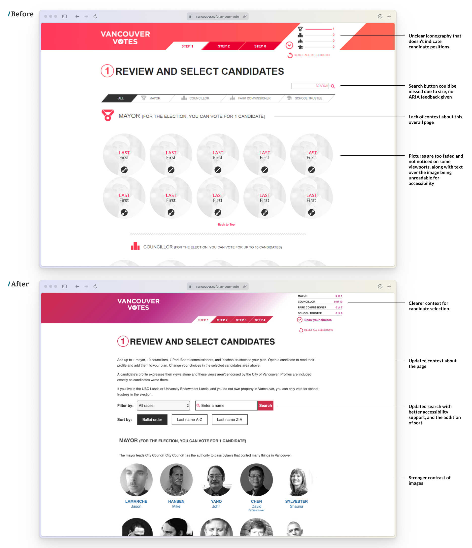
The updated home page provided clearer numerical context about the candidates chosen (text vs. unclear icons), updated copy to explain the page function, a more clear search functionality, and better contrast of images. Better ARIA support was updated as well.
Candidate overview and review:
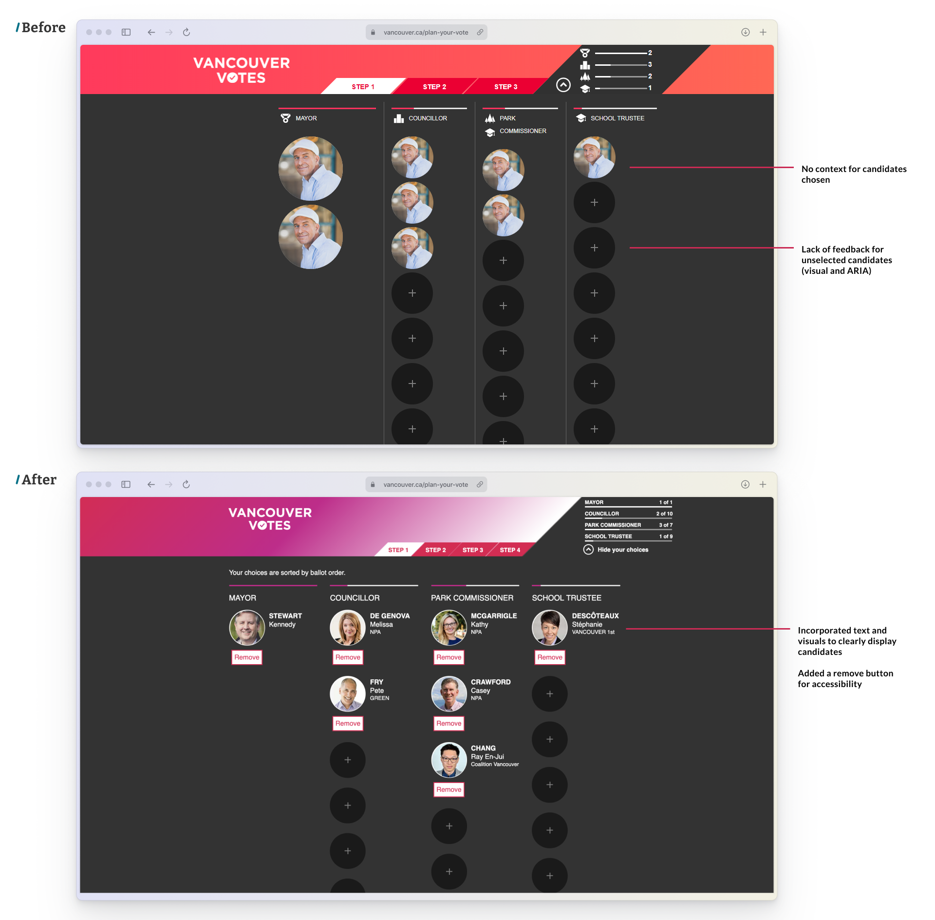
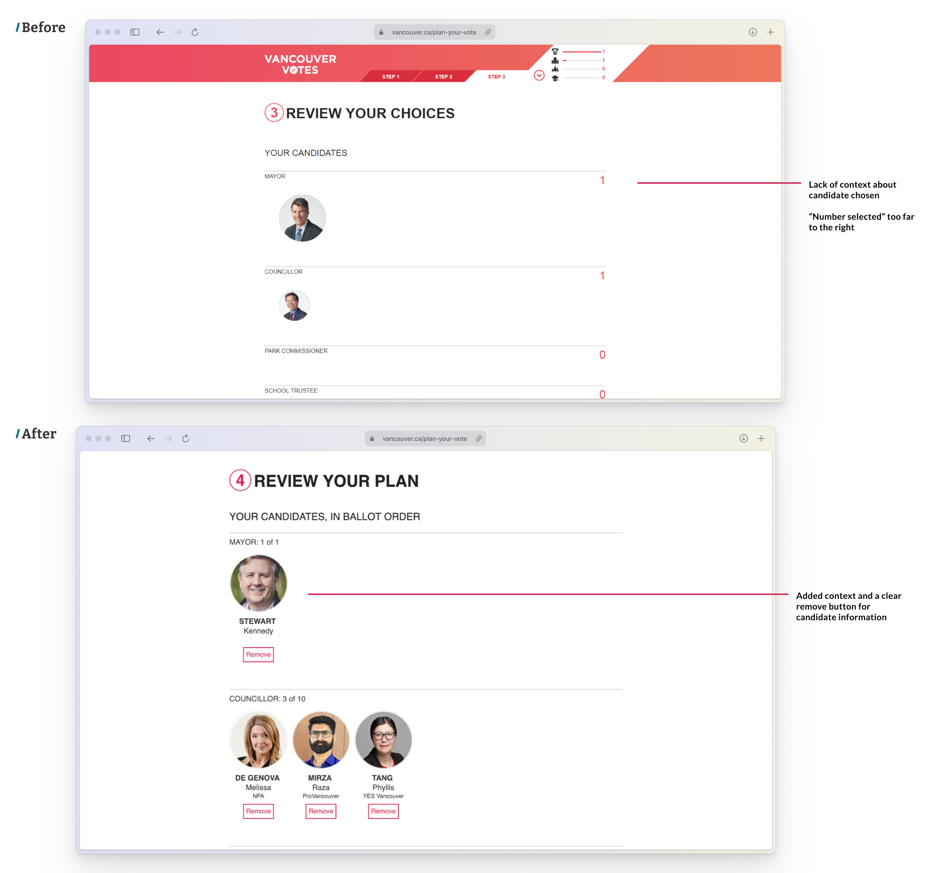
Updated candidate selection and review candidate screens, with more clear actions to remove candidates and see their information.
Location selection:
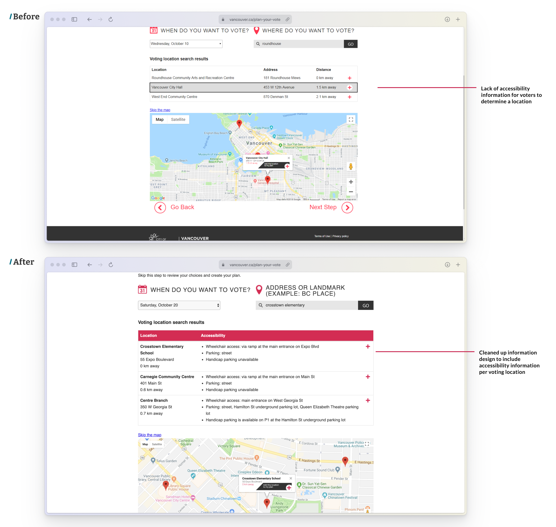
Choosing a voting location was re-designed, to include accessibility information about voting locations.
The Impact
This microsite was featured on the Disability Alliance of BC website that notes the upgrade to accessibility, along with local news sources, such as VanCourier.
To see how this microsite fits into the voting platform strategy, this video produced by the City showcases the integration of Plan Your Vote.
Reflection
This project was quite special to me, as this is the first project professionally that got released. Being able to contribute to the overall voting landscape designing for citizens to help them vote, and consider our accessibility community, was one of the biggest takeaways from the project!